Pick up any other Moonwatch and the case has polished facets running down the sides of the lugs. It is one of the details that makes a Speedmaster look expensive in the light.
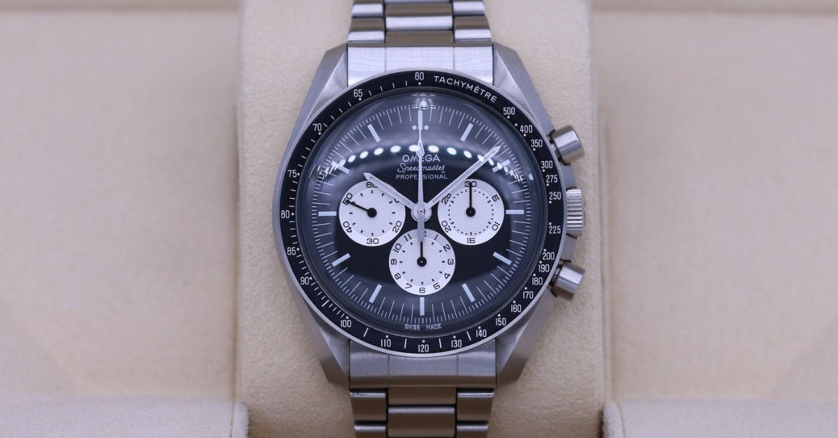
Omega took them off this one. The Speedy Tuesday's case is fully brushed — no polished bevels anywhere — which, combined with a matte black dial and a matte black aluminium bezel, makes it the least shiny Speedmaster ever sold. The only bright things on the whole watch are two silvery subdials and a rhodium-plated logo.
That was a deliberate decision, and it is the single most useful thing to know before choosing a strap.
The fit: 20mm, nothing to select
Your Speedy Tuesday is the 42mm Speedmaster case, so the lug width is 20mm — the same as every other Moonwatch.
Every strap in our Speedmaster collection is cut to 20mm, so there is no width dropdown to get wrong. The only choice is buckle colour, and silver is the one: the case is brushed steel throughout and a black or gold buckle would introduce a finish the watch does not have.
Spring bars are included, and the Omega strap installation tool makes the swap painless.
What you own
A 2017 limited edition of 2,012 pieces, made for the fifth anniversary of the #SpeedyTuesday hashtag — and the first watch Omega ever sold through its own website, where it sold out in a few hours.
A 42mm fully brushed steel case, water resistant to 50 metres, under a domed hesalite crystal with the Omega logo in its centre. Inside is the calibre 1861, manual wind, 18 jewels, roughly 48 hours.
The dial is a tribute to the 1978 "Alaska Project III" that Omega built for NASA: a reverse panda, black with white opaline silvery subdials, using the radial numeral layout that gives the reference its second nickname. The applied Omega logo is vintage-style and rhodium-plated. The hour markers carry Super-LumiNova, and the markings and subdials are coated in luminescent ink — so at night the dial does not simply show lume, it becomes lume.
The caseback is engraved "SPEEDY TUESDAY ANNIVERSARY – A TRIBUTE TO ALASKA PROJECT III," your edition number out of 2,012, and the word RADIAL. It arrived on a vintage-style brown leather strap, in a watch roll with a spare black and white NATO.
The rule this watch sets
The reverse panda dial already contains all the contrast a watch needs. Black base, white subdials, white markings — the two-tone is built in.
So a strap here is not adding contrast, it is deciding whether to respect what is already there. And because Omega went to the trouble of removing every polished surface from the case, anything glossy, bright or busy on the wrist reads as a mistake rather than a choice.
Matte, dark and simple. Everything below follows from that.
1. Black — add nothing at all
The right answer more often than not, and on this reference it is not a default, it is the argument. Omega de-shined the case on purpose; plain black rubber is the only strap that continues that thinking rather than interrupting it.
Put this on and the watch becomes one uninterrupted matte black object with two silver discs floating in it. That is exactly what the Alaska Project dial was designed to look like, and it is the version that shows off the lume best at night, because nothing else on the wrist competes. Black rubber strap →
2. Black with a white line — the dial's own scheme
The reverse panda is black with white. This strap is black with white. It is the most literal match we make for this reference, and it works because the white is a single fine line rather than a block — the same restraint the subdials show.
Slightly sharper and more technical than plain black, and the better of the two if you like the radial numerals being noticed. Black w/White Line LuxLine® →
3. Beige — lean into the vintage brief
This watch is a 1978 reissue with a hesalite crystal, a vintage applied logo and a dial covered in luminescent ink. Beige is the strap that agrees with all of it: warm, soft, and close to the colour aged lume goes.
It also does something specific to a reverse panda — against a warm strap the silvery subdials read as cream rather than white, which pushes the whole watch further towards the 1970s. The least obvious pick here and the one that makes it look oldest, in the good way. Beige rubber strap →
4. Grey — continue the brushed case
The quiet one. Grey rubber sits at roughly the tone of brushed steel, so instead of ending the case at the lugs it carries the finish onward and makes the watch look longer and more of a piece.
On a Moonwatch with polished bevels this would be a subtle effect. On a fully brushed one it is the closest thing to a factory finish we make. Grey rubber strap →
Related Omega guides
- Omega Speedmaster Ultraman 311.12.42.30.01.001 strap guide — the second Speedy Tuesday, and the opposite colour brief
- Best straps for the Omega Speedmaster Moonwatch 310.30.42.50.01.001 — same case, same 20mm
- All Omega strap guides
Ready to change it?
Helvetus is one of the largest names in aftermarket luxury watch straps, and every Omega strap we make is cut to a specific case rather than trimmed from a universal blank — so a Speedmaster strap fits a Speedmaster, with no gap at the lugs and no guesswork at checkout.
All rubber straps carry a lifetime warranty. Shipping is free worldwide, there are no import costs wherever you order from, and more than 50,000 customers have already made the swap.
Browse all Speedmaster straps → See the full Omega strap range →
Helvetus is not affiliated with Omega SA. Model names are used for compatibility reference only.