Every other MoonSwatch changes colours. This one changes how the chronograph counts.
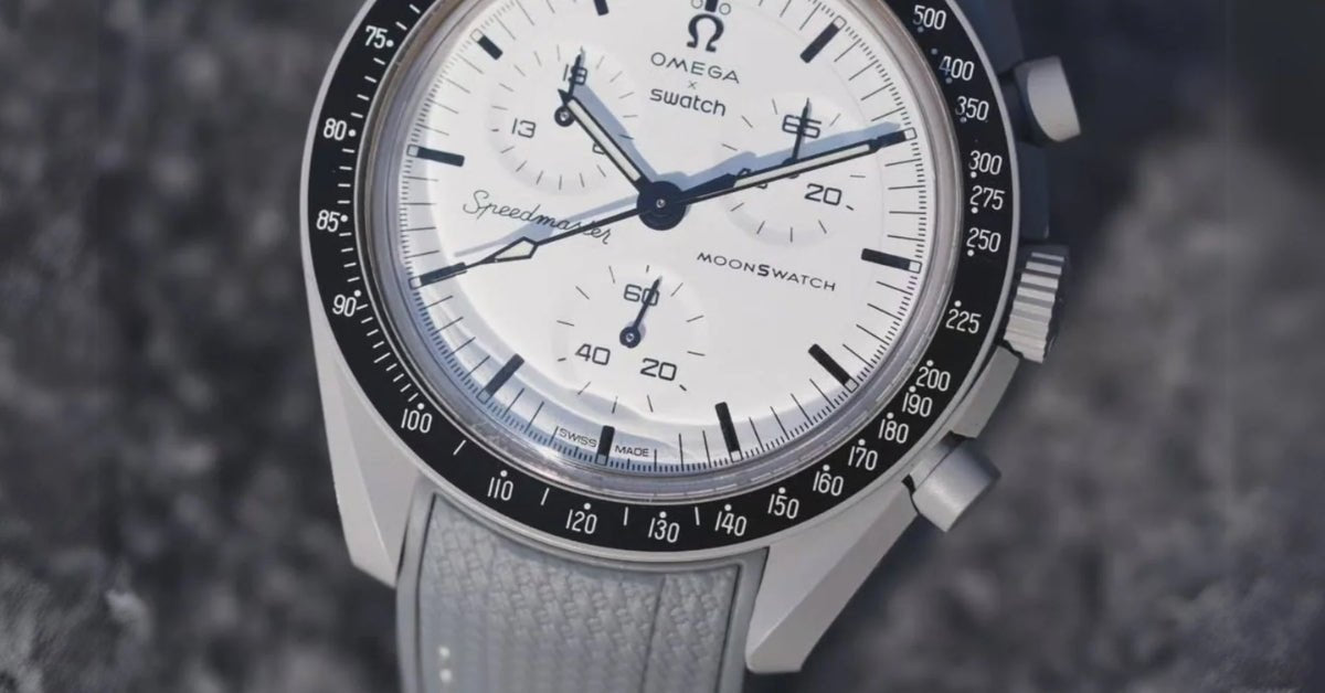
Look at the two upper sub-dials. The counter at 10 o'clock reads 19 where every other MoonSwatch reads 60. The counter at 2 o'clock reads 65 where the others read 10. That isn't printing — Swatch recalibrated the movement so the register at 10 runs to nineteen hours and the register at 2 runs to sixty-five minutes, purely so the dial spells out 1965. The small seconds at 6 o'clock still reads 60, which is the anniversary.
There's a real trade in that. You lose the tenth-of-a-second counter the standard MoonSwatch has, and you gain the ability to time something for longer than an hour. It's the only watch in the collection that actually works differently from the rest.
The size: 20mm
The MoonSwatch 1965 takes a 20mm strap, like every other watch in the collection. Same case, same width, nothing to measure.
Worth knowing before you shop: our mission collections are a colour menu, not a compatibility list. Every MoonSwatch strap we make is 20mm with the same 126mm and 78mm lengths, cut for the same 42mm case. A strap filed under another mission fits this one exactly as well as one filed here — though on this model three of the four picks below come from its own collection.
Everything on this watch is a reference, except the strap
Here's what makes the strap decision unusually pointed on this reference.
The 1965 marks sixty years since NASA qualified the Speedmaster for manned spaceflight, on 1 March 1965, after eleven tests that eliminated everything else submitted. And Swatch built the watch as a set of citations. The OMEGA logo is the one used at the time, applied rather than printed. The typeface on the dial is the period typeface. The white dial nods to the white-dialled Moonwatch Professional. The grey Bioceramic case is a deliberate matte stand-in for the steel of the original. The counters spell the year. And the Moon on the battery cover is historically accurate — no footprint on it, because in 1965 nobody had left one yet.
That last detail tells you how carefully this watch was thought about. Which is exactly why the one component that references nothing stands out: a grey hook-and-loop band, a perfectly ordinary 2020s Swatch part with nothing to say about 1965 at all.
It's also, as reviewers have pointed out, the MoonSwatch you could wear without anyone looking twice — a light grey case that reads as steel at a glance and a dial that could pass for a Speedmaster across a table. The fabric band is the single thing that gives it away instantly.
One practical note. Bioceramic is hard but marks more easily than steel, and the case is a monobloc that can't be sent away for a tidy-up — so work on a soft cloth, keep the spring-bar tool square to the bar, and keep metal away from the case flanks.
The best straps for the MoonSwatch 1965
1. Black on black — side with the bezel and the hands
The most convincing answer, and the one that makes the illusion hold. Everything dark on this watch — the bezel, the hands, the markers, the sub-dial numerals — is black, so a tone-on-tone black strap continues the watch's own darkest element rather than introducing a new tone. The result is a grey-cased, white-dialled chronograph on a black band, which is precisely the configuration a vintage Speedmaster wears. Start here.
2. Grey with white — the factory idea, sharpened
Swatch shipped this watch on grey with contrast stitching, and the thinking was right: grey continues the case rather than the dial. A grey strap with a white line keeps that relationship and adds what the fabric never had — a defined edge and a crisp bright line that picks up the white dial. It's the most cohesive the watch looks, and the closest thing to an upgrade rather than a change.
3. White with a black line — side with the dial
The boldest of the three, and the summer option. A white strap with a black line extends the dial past the lugs instead of the case, which flips the watch into a bright object with a grey ring around a white face. The black line keeps it tied to the bezel so it doesn't float. Worth trying if you find the grey case too quiet.
4. Black with a white line — the tachymeter, continued
The pick that pays attention to the bezel. That black bezel carries a white tachymeter scale, and a black strap with a white line repeats exactly that relationship below the case: a dark ground with one fine bright marking running through it. It's the most quietly clever option here, and it's filed under a different mission, which is exactly the point made further up.
The short version
20mm, like every MoonSwatch. Black on black to make the vintage read hold, grey with white to sharpen the factory idea, white with black to lead with the dial, black with white to echo the tachymeter.
Every strap in our MoonSwatch 1965 collection is cut for this case, ships with spring bars included, and carries a lifetime warranty on rubber — with free worldwide shipping and no import costs, part of why more than 50,000 customers have trusted us with their watches. There's a full MoonSwatch strap guide covering every mission if you own more than one. Helvetus is not affiliated with Swatch AG or Omega SA.
PUBLISHING NOTES
ONE PRODUCT NEEDS CHECKING BEFORE THIS PUBLISHES
The product titled "Rubber Strap - For MoonSwatch 1965 - White with Black Line" carries a DESCRIPTION that reads "Helvetus Rubber Strap for MoonSwatch in Black w/White" and describes "the striking black base with white detail". The title and the description describe opposite straps. Pick 3 is written to the TITLE (white ground, black line). CONFIRM WHICH IT ACTUALLY IS and, if it is black with white, either swap pick 3's wording or drop it in favour of another colour - it is a one-sentence change either way. This is a NEW class of fault for this section: previous ones were title-versus-handle mismatches, this is title-versus-description inside a single product page. Worth adding to the handle audit's scope.